Tuesday, November 8, 2011

Downsizing....Part Two.


Continuing from my last post.....you can see the front door entrance.  Although a little dated, just painting it milk, enhanced the glass oval insert, and sets off the bevelled glass and brass features.
It picks up on the glass prisms of the chandelier and ties all of the glass inside the kitchen and dining areas together.

Here you can see the new counters more clearly.


A good view of the dining room, not overly large, but it accomodates her ten dining chairs easily when needed for special family gatherings. We moved the other two chairs to different areas of the house.

Looking for an area carpet to soften the space between table and flooring.  Perhaps something with soft taupes, creams  and a touch of black? or some colour?


This is the living room, which you step down to from the front foyer.
A new wood floor replaced the old one, which was a much lighter colour.


This furniture was also from her original home, a lovely butter colour plush velour like fabric on the soft furnishings.

We kept the coffee table, and the gorgeous tub chairs. Another example of longevity for items with good design features that don't scream "trendy".


I wish I had taken a picture of these chairs before they were reupholstered in the soft zebra fabric.

They were covered in a fun red "Bollywood" design from a previous decor. Sandy had kept them stored in her basement, and I knew they would look great as accent chairs for this room.
Notice the white doggie on the hearth in the family room, a gift from a dear friend.

Still on the hunt for the perfect area rug to finish off this space.


I found this gorgeous piece for Sandy several years ago. It looks very French and the lovely marble top has just the right amount of wear or patina to it. I had the lamp made from spare chandelier parts  and the matching one is on her little buffet in the dining room. Yet again confirming good design is never dated.
The beautiful gold leaf mirror is a keeper and looks lovely with the intricate design on the chest.


The lovely tub chairs at the far end of the room, anchor it. Notice the beautiful vintage floor lamp I found at a local antique shop. It casts a soft glow on the oil painting above.

Here you can see the gorgeous fringe treatment on the chairs and a better look at the fabric detail.


Two tiny gilded birds reflect the candlelight atop the mirrored coffee table.

Sandy is a wonderful hostess and great cook. Although she was giving up some square footage in this home, she was not prepared to sacrifice any living or entertaining space.The layout of this area of the house is very condusive to groups of guests or family spreading out into the adjoining rooms quite easily and effortlessly.


More of that soft butter colour in accents used here and there in the living room.


This beautiful vintage candle sconce is another great find that fits in beautifully.


This table top lamp is the second set I have sourced and been commissioned to make.
I love the way they work into any space. Here I have grouped it with another lamp, something I am doing a lot of lately, grouping lamps!

I love making things out of what others consider insignificant and watching them come to life.

The tinkering and puttering in me.


A view of the living room from the family room. All of the pieces here were kept, and as you can see work very well.  The leather sofa and chair are prerequisites for Don, and are softened with
tapestry pillows  and vintage throws.


....another view of the little details that make a room interesting.


Since I have known Sandy she has always played hostess to many gatherings in her homes for family and friends alike. Throwing parties for friend's daughters engagements, her family's birthdays and anniversaries is nothing for Sandy to orchestrate, she gives generously of her time and her home.

Just two short months after moving into this, perhaps her last home, they welcomed a beautiful little grand-daughter, Lily.  Sandy advised me that she would be hosting a baby shower for Lindsey a month after moving. I was never doubtful that she would not be finished with the renovation in time for the event...and she was!

This home, Sandy says is her favourite!

I want to thank Sandy and Don for inviting my readers into their home.

I hope it will inspire you when decorating or renovating yours.

Posted by Picasa

Downsizing, editing, living.


My friend Sandy and I have been close friends forever.  We met when we were 18 years old and have shared life's joyous moments as well as difficult ones together.  When she asked me to help decorate her latest home, I was thrilled.  Besides sharing so many memories, we also love many of the same things, good design sense, vintage, comfort and beauty in our homes, attention to detail, and a love of family.


This is the home she and Don purchased this spring. Downsizing, but not willing to give up anything, they moved from a 3500 sq. ft. two storey, to this back split, with good "bones" and a great layout.
However, a major interior redo was in order.


The "before"  kitchen, as seen as soon as you enter the front, to the left of the entry.


The step down, to the family room, with the fireplace, looking very front and center, but a nice shade of grey. 


Sandy decided to enlarge the staircase by widening it, and extending it, with deeper treads. This would give it more of a grand presence, as well as make it safer for use in the future. A front hall closet for jackets or coats was also added.


Here, you can see into the" before"  kitchen. Sandy is protesting, no pictures please!!!

Before I went to work, she had a few requests.  She loved the new white and light interiors, with a hint of a "french look".  She expected to keep the majority of her furniture, except for the dining room pieces which she gave to her niece.  She had already purchased a lovely, pickled white dining table and everything else was open to suggestion.


A peek into the new kitchen. Simple white cabinets, new stainless steel appliances, an addition of a new window over the sink and a large island, replacing the small former one.
Simple taupe and grey quartz countertops and smaller tiles for the back splash.
The stools for the island which had to be cut down to counter height, echo a bit of a french style bistro feel.
Already you get a sense of openess, clean and bright, and softness with simple overhead pocket lights.
We decided to fore go the usual hanging pendants over the island, since the now open adjoinging dining room would have it's own beautiful fixture.

A view of the new kitchen from the dining room.


Another corner of the kitchen as seen from the dining room. Here you can see Sandy's lovely collections which make her home so personal and inviting.

The lovely dining room chandelier which I found for her. It had to be completely rewired, found without a single prism!  The finished result was very satisfying and Sandy loved it!


The walls were all painted the same colour throughout the entire home, a lovely shade of milk, and the sisal look carpets were also the same colour.


A glimpse of the widened staircase.  I decided she should leave this little, adorable wicker table at the bottom, to use as a catch all for keys and things, and seasonal touches.


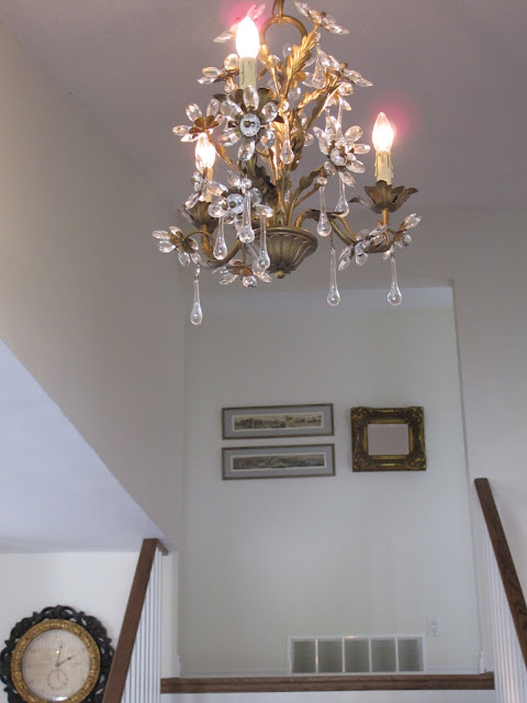
We are still on the hunt for the perfect hallway piece for the upper landing, to hide the register and add the finishing touch to her grouping of etchings on the wall.

I found this gorgeous little fixture for her entry. Notice the little glass rosettes and beautiful tear drop prisms. I love it.


The dining room as viewed from the kitchen.
We added the linen covered chairs to further compliment the casual french look she wanted.
Notice the mirror above the small buffet. It was a very ornate, bronze coloured one from a previous decor scheme. I had it painted and antiqued and distressed. It worked out perfectly with a small server she had in her kitchen in her previous home.  I really tried to keep all of her "good" pieces and utilize them in a different way.

I angled the dining table to give the space more depth and interest.


Reuse, repurpose and redefine old pieces if you can.


More of Sandy's lovely collections, which we have sourced together and apart over the years!


When downsizing, wondering what to keep or discard can be very emotionally draining, but objects of true beauty or value to the owner, rarely need editing.


Another pretty vignette, tarnished silver and soft, pretty white china pieces, of sentimental value to the owner.

I will continue to post on this transition in life and lodging of a dear friend.

Posted by Picasa